It’s been 85 years since Superman became an indelible part of culture the world over. We’re talking decades of action comics, decades of championing truth and justice. And decades of Halloweens where children and adults have been wearing blue suits with a red cape around their neck, immediately recognizable. The debut of Superman was not just the invention of the superhero as we know it today, but also the superhero costume.
Over the years, minor details have changed—a more stylized emblem, the length of the boots, the elimination and eventual restoration of the red trunks—but Shuster’s original design has always shone through each redraft as the definitive iconography of a hero. Still, a man can’t be expected to wear the same outfit ALL the time. Many great artists have taken the opportunity to mix things up with Superman’s costume over the years—all of which have earned a degree of controversy. That’s always going to happen, after all, when you alter a classic. Today we look through the Wardrobe of Solitude to identify the most striking ensembles in Superman’s sartorial repertoire.
The Classic

PROS: It’s the greatest superhero costume of all time.
CONS: Some people have a problem with the trunks.
It’s the best-known superhero costume for a reason. Shuster really got it all close to perfect on the first go. The cape, the emblem, the trunks—yes, the trunks. We’ve heard all the “underwear on the outside” jokes. It’s an easy target. But that pop of red really works to break up Superman’s silhouette, letting readers easily identify his limbs in action as the cape conveys movement. Every detail in Superman’s original costume design serves a purpose, like an architect designing a tall building over which to bound. These simple, primary colors give Superman a figure that any artist can draw, that any child can recognize and that any in need can look to in the sky and know that help has arrived.
The Black and Silver

PROS: Slimming, goes with everything, badass.
CONS: Maybe not Superman’s tone.
When Superman returned from his demise in the world-stopping “Death of Superman,” it wasn’t as the figure of hope and comfort we know. With a costume stylized in black and silver, Superman’s regeneration suit suggested a darker Superman more in line with a more extreme, violent period in comics. Would this new Superman be the same one we had always known in spirit? Like Luke Skywalker dressed in black for Return of the Jedi, we needn’t have worried. It wasn’t long before Clark ditched the silver and was back in blues. Admittedly, this is a pretty sweet look for a vengeful Superman looking to strike a little healthy fear in his enemies. Even Zack Snyder couldn’t resist going back to it. But…it may be a little too Batman.
The Electric Blue

PROS: Self-generated, haute couture every time.
CONS: Not very huggable.
The second rule of the ‘90s: if you can’t go dark, go BRIGHT. Electric, neon bright. This attempt to bring Superman into the dawn of the 21st century with a massive overhaul of his powers and design was a radical (in all senses of the word) departure from the Man of Steel we know and love, but…if you allow yourself a little distance, and try (really try) to forget everything you know about Superman…it’s objectively a pretty cool look? Just…maybe not for Superman. (Superman’s son, on the other hand…well, keep reading Adventures of Superman: Jon Kent.)
The Mother Box Makeover

PROS: It definitely looks like he's going into battle.
CONS: We know it's the '90s, but why are half these straps even here?
The word “toyetic,” coined by toy designer Bernard Loomis in the 1970s, describes the amount of potential and intentionality of a design to be adapted into a toy. As in, “This battle-ready design trotted out for Superman’s rematch with Doomsday is certainly toyetic.” Designed for Superman by a Mother Box from New Genesis, you can almost see the intent here of presenting Superman with a Jack Kirby-style Fourth World makeover. But if you really need a Kirbyesque Superman, well, we’ve already got a perfectly good Orion.
The Golden Boy

PROS: The “S” shape is a little avant garde, but this statue makes a nice tribute to Superman.
CONS: What do you mean it’s not a statue?
We’ve touched on the importance of different elements in Superman’s color palette breaking up his shape to make it legible, but the pure golden skin he sports emerging as a godlike figure over eighty thousand years in the future in DC One Million is effective on a pure awe-inspiring level. It wouldn’t really work as a consistent look in a line of stories, but as an expression of the totemic figurehead to which the immortal Superman is headed on his trajectory from hero to legend, it all works as a whole. Wouldn’t necessarily want an animated series about this guy, but a high-quality action figure would be dynamite.
The Beyonder

PROS: Sleek, clean lines representing the pure elements of Bruce Timm’s aesthetic.
CONS: You know what the Kingdom Come look needed? Less color.
What happens when you apply the sleek futurism of Batman Beyond to an aging Man of Steel? You get this grim monochromatic figure, apparently. Inspired both by his regeneration suit and the jaded, somewhat distant Superman of Kingdom Come, Superman here has lost many of his touchstones to humanity with age, and the alienness of his costume reflects it. It’s a costume that the DC Animated Universe would cleverly allude to again in the Justice League animated series with their “Justice Lord” Superman shifting towards its design, suggesting an inevitable future of a tyrant son of Krypton. It’s a costume perfectly suited for a darker take on Superman born from a failure to maintain the bond with his adopted world—or, in other words, a perfect depiction of Lex Luthor’s greatest suspicions about the Man of Steel made real.
The New Kryptonian

PROS: For the context, it works.
CONS: Can we really say this is Superman?
This smart militaristic jumpsuit with an understated emblem representing the House of El was one of Superman’s most dramatic departures from his traditional look, for the “New Krypton” storyline of 2008 which reunited him with a restored population of Kandor. It’s remarkable, really, in its unremarkabilityl—almost nothing at all like the evocative, multi-colored jumpsuit which defines Superman as we know him. This, of course, is intentional: it’s a look which immediately conveys that Kal-El has renounced the mantle of Superman entirely, choosing instead to rejoin his lost people as one of their number. It’s a status quo which never could have lasted, but one which explored a side of Superman we rarely get to see, sartorially or otherwise.
The People’s Champ
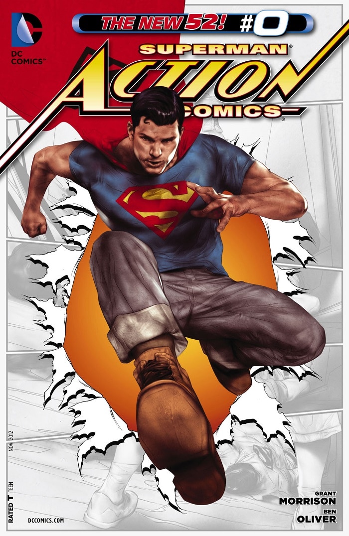
PROS: Conveys Superman as a Man of the People, a Working Class Hero.
CONS: Underdressed for Justice League functions.
KONS: We swear we’ve seen this before.
When Grant Morrison and Rags Morales were reinventing a young Superman for a relaunched comic canon, the mission was to reunite him with his original mission statement: a champion of the common man, representing their struggles against an oppressive ruling class. Clad in jeans and a t-shirt, this Superman was dressed a lot like…well, regular Superman fans you might see in real life every day. It’s effective at conveying a particular tone for an evolving era of Superman’s life, but we can’t help but feel like someone’s already done this look…oh, yeah. It was your clone son, back in the 2003 Teen Titans series. Quit raiding Conner’s closet, Clark. You’re in your 80s now.
The New 52

PROS: No more “underwear on the outside” jokes.
CONS: Armor on an invulnerable hero might seem a mite extra.
While Morales’ simple Superman design connected him with his past, the Jim Lee redesign of Superman’s outfit for the modern era took him in the opposite direction. Futuristic armor plating and angular lines, a belt line replacing the signature red briefs, the collars, the sleeves, the boots—this was the closest Superman has ever come to a complete redesign, and it remains perhaps the most controversial Superman costume ever. Many welcomed the change as a much-needed update to Superman’s image. Others lamented the loss of the simple beauty of the original. But as Dream of the Endless once said, all great stories eventually return to their original form. The briefs were back by 2018, and it seems like they’re here to stay. To split the difference, Jon Kent sports the trunkless look as Earth’s other active Superman. Who says you can’t have it both ways?
The Warworld Daddy

PROS: Hatchi matchi.
CONS: Not in front of the kids!
A suffocating symbol of oppression. A mockery of Superman’s identity as a tool of subjugation at the hands of a cruel warlord. A physical straining against the yoke of tyranny with every ounce of strength the Man of Steel can conjure for the cause of freedom for all life in the universe. This costume thrust upon Superman in the epic “Warworld Saga” represents the Man of Steel at one of his lowest points and how he met that challenge to fly higher than ever before. But like…it’s also super hot. We’d make jokes here about Lois holding onto this one for some private roleplay, but we can’t because that’s already canon. Supes is a certified freak for real. Get it, babygirl.
For specially created articles, original videos, free-to-read comics, limited edition merchandise and more celebrating Superman’s anniversary, be sure to visit our official Superman hub.
Alex Jaffe is the author of our monthly "Ask the Question" column and writes about TV, movies, comics and superhero history for DC.com. Follow him on Twitter at @AlexJaffe and find him in the DC Community as HubCityQuestion.
NOTE: The views and opinions expressed in this column are solely those of Alex Jaffe and do not necessarily reflect those of DC Entertainment or Warner Bros., nor should they be read as confirmation or denial of future DC plans.