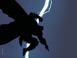
I asked Sean Murphy to describe what he tried to capture on the cover of JOE THE BARBARIAN #3 and here’s what he had to say:
"For issue three of JOE THE BARBARIAN, Joe and Jack (his warrior rat friend) escape a losing battle by diving into a Dwarven submarine. As heroic as Jack is, one thing he’s terrified of is enclosed places. Which made the escape scene not only exciting and action packed, but also pretty funny. The irony is that Jack is by far the largest character in the sub, so he’s even more cramped than the other passengers. The scene was my favorite from the issue, so I figured that it would make a good cover.
I tried to fit in the action and humor I just described. Obviously, most of the cover is used to show the dark innards of the submarine and how scary it must feel for our heroes—especially Jack who’s a claustrophobic. I tilted everything onto an angle to suggest the rolling motion that a sub might have, and I feel the dramatic light sources of the lantern and the crystals where perfect slow, underhanded pitch to Dave Stewart (who would then knock it out of the park).
So far it’s my favorite cover. I think that with all the black it should stand out on the shelves. Hopefully the title block’s colors will be adjusted to reds to help unify the whole piece."
Now, to reveal the cover. What do you think? Did he accomplish what he set out to do?

Editorial
Sean Murphy talks JOE THE BARBARIAN #3 cover
BY: DCE Editorial
Monday, December 21st, 2009